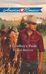
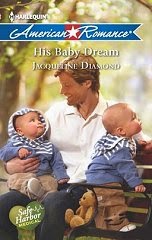
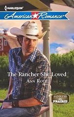
 What is a picture worth?
A second look? A hands-on exam? Drooling over? LOL
Above and to your right (I hope!) is the cover of A RANCHER’S PRIDE, my May 2011 Harlequin American Romance. Is Sam Robertson drool-worthy or what?
In my humble opinion—which may be just a teeny bit biased—he’s a hottie. A hunk. A honey. Or whatever word you’d like to describe a hero of your dreams. And he’s getting quite a bit of attention from readers. Wonder why? (smile)
A RANCHER’S PRIDE is part of the Men of the West miniseries from Harlequin American Romance. The covers have been fabulous. And if you ask me, American makes a habit of that!
All the May Americans look great, too, with a cowboy, a wedding, and babies times three.
 I’ve been lucky from the start with my covers.
Here’s a shot of my very first book, THE SHERIFF’S SON. Isn’t it adorable? And it was so perfect for the story, I got teary-eyed the first time I saw it.
 My second book, COURT ME, COWBOY, also had a cover that matched the story perfectly. I’ll give you a hint with this one...the package is very important. (Well, the full package, Gabe included, is special, too.)
 And the cover for my previous book, FAMILY MATTERS (October 2010), catches both my hero and heroine at a perfect moment. In addition, though I hadn’t seen the cover before my website was revamped, the flowers just happened to tie in...perfectly!
Are you noticing something they all have in common? LOL I'm very happy with perfection. (smile)
When it comes to the differences--kids, couples, hot heroes--they’re all good, too, as far as I’m concerned.
How about you? When you walk into a bookstore or browse online, what's the first thing that catches your eye? What do you most like to see on a cover?
Leave a comment or question to be entered in a drawing for a copy of either THE SHERIFF’S SON or COURT ME, COWBOY. Here’s the scoop.
By Wednesday night:
1. Leave a comment or question for me here.
2. Visit my website http://www.barbarawhitedaille.com/ and send me an e-mail from the comment form, letting me know which book you’d like to receive if your name is drawn.
The winner’s name will be posted here in the comments section of this blog post on Thursday.
Also, while you’re at my website, you might want to check out the blog tour I’m currently on to celebrate A RANCHER’S PRIDE. There are more tour stops and book drawings ahead.
Thanks!
All my best to you,
Barbara
~~~~~~
Barbara White Daille
http://www.barbarawhitedaille.com/


23 comments:
Hi, Barbara! You are cover-blessed : )
I love my books from cover to cover and everything in-between! There are certain colors which always catch my eye, like deep perriwinkle blue. I appreciate covers which offer a glimpse of the characters and some element of the story line, not just a "lover's clinch". I do find it somewhat disconcerting when the characters and images, even the back blurb, do not match the content of the book. It's really bad when the character names given in the back blurb are different than the names of the characters in the book!
gcwhiskas at aol dot com
Cover-blessed is a great way to describe what you have. Anyone can take one look at your books and know what it's about.
I'm blessed too, to have a fantastic cover artist. I think she's the best!
Hi, Virginia - yes, I've been very, very fortunate!
I'm with you about wanting to learn a little about the story by the cover. (Unless it's simply a shot of a hot hero! LOL)
I've also been so lucky about my covers going along with the book. And sometimes--as in Sam's case--they turn out even better than I imagined.
Thanks for stopping in!
Barbara
Hi, Edie!
You and Virginia are both so right. ;-)
I think it's a big plus for those readers who are more visual to get so much of the storyline from the cover.
And yes, your cover artist *is* fantastic! All your books look great.
Barbara
I have to admit. I'm guilty of looking for that Stetson, that man in plaid or a snap-front shirt. I long for that equine in the background along with those mountains or plains dotted with a herd of cows. Oh, yes, give me the American Knight... the cowboy. Cover art draws me first, followed by the author. If I've read her, I get excited. The clincher is to pick up the book and read the back cover. Does it have the adventure, romance, the sprawling feel of my vision of the west. If so, I slid it into my purchases.. So far you haven't failed me yet. Keep writing and I'll keep reading.
Nan
Nan - thank you for that beautiful compliment. I'm touched. And I hope you enjoy A RANCHER'S PRIDE.
As for your favorite covers, there's just something about a man in a Western shirt, isn't there? Seeing him in his natural setting makes it all the better.
I think that's why I love Sam so much on that cover! ;-)
Barbara
Yes, covers do have an effect when I'm walking through a store looking at books. If I'm embarrassed to be seen hold the book, I don't buy it.
But you have very very lucky with your covers. My favorites are the first one (too cute) and this last one (too sexy!)
Cyndi - I'm thinking cute to sexy and back again is definitely the spectrum I'd like my covers to run on. ;-)
Thanks for stopping in!
Barbara
I, too, can't resist a good cover, and yours are terrific, Barbara. The Rancher's Pride is a great read, truly deserving of its awesome cover.
As someone who (should) know what she's talking about, I have to give your covers 2 thumbs up!
I really like the latest one... that guy is HOT!!!
Too often when I'm looking for stock of cowboys, they are waaaay off the mark. your's are great!
A good cover will stop me in my tracks. I'll pick up the book and bring it closer for a better look, if it still has my attention, I turn it over and read the blurb, if it still has my attention, I buy it!
A good cover will have me looking at the book. I love the covers of your books. They are eye catching.
Someone came in and fixed all my covers on the post! I'm sure it wasn't a Blogger gremlin. ;-)
And we should probably chat. LOL
Thank you!
Barbara
Leigh - I'd say you've had both ends of the spectrum already, too. Great covers!
And thanks so much for your kind words about A RANCHER'S PRIDE.
Barbara
Laura - you darn sure *do* know what you're doing! And you just keep getting better and better. (Right, Edie??)
Thanks so much for your comments--that's high praise. As I had nothing much to do with the cover, I'm honored on behalf of the artist who did.
Barbara
Karin - excellent proof of the importance of a good cover.
Umm...I hope you don't bring YOUR books too close for a better look--you might singe your eyelashes! LOL
Barbara
Becky - thanks so much. Catching the eye is what it's all about.
The artists who did my covers ROCK!
Barbara
I look for series first, authors second and then the covers third. If the cover captures my attention, I buy it, if not I read the back cover and then maybe an excerpt. Your covers are wonderful. I really enjoyed A Rancher's Pride.
I look for series first, authors second and then the covers third. If the cover captures my attention, I buy it, if not I read the back cover and then maybe an excerpt. Your covers are wonderful. I really enjoyed A Rancher's Pride.
Linda - thanks so much! I'm glad you enjoyed the book.
And when I'm book shopping, line is always a big factor with me, too.
Barbara
I look for the type of book first (American Romance, Desire, Blaze, etc.), look for certain authors, read the blurb, and then buy - if in a store.
I prefer nowadays to read online what others are saying (readers and authors). I check out the blogs and authors' web sites, I read the excerpts and blurbs, and I write write write what catches my eye. Some authors have become "must reads" when I haven't read their blurbs yet.
As for covers, I don't really care, as they often don't match the inside description anyway.
The bottom line (to me) is: One can never have too many books. Right?
Laney4 - you are so right that one can never have too many books! I'd rather buy them than clothes.
And definitely, readers and authors both are lucky now to have access to the Internet to help spread the word about books.
Thanks for sharing your thoughts.
Barbara
A name has been drawn!
And the winner is...
Laney4
Congrats!
As you've already contacted me via my website, I have your info and will be in touch.
Barbara
Post a Comment